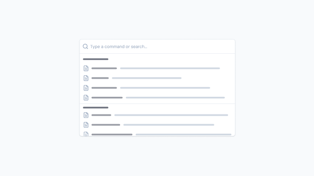
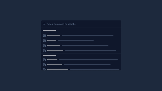
Components
Layout
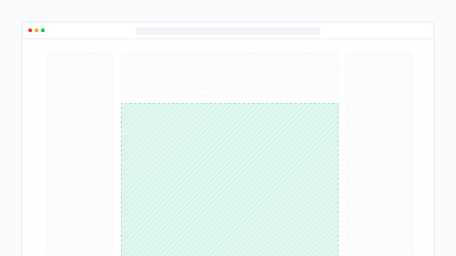
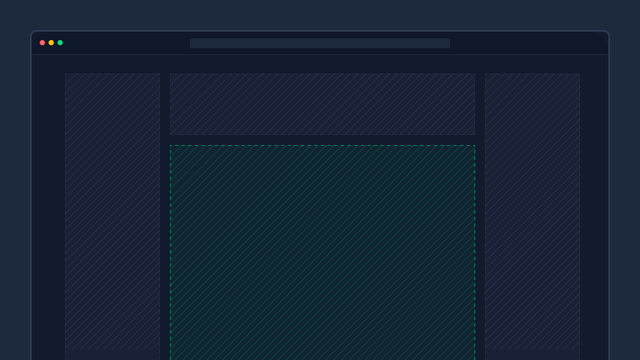
Structural components for organizing your app's layout. Start by wrapping your app with the App component.
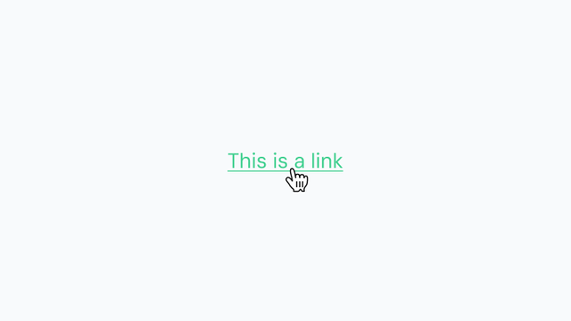
Element
Essential UI building blocks such as buttons, badges, icons, avatars, and other foundational interface elements for crafting intuitive and consistent user experiences.
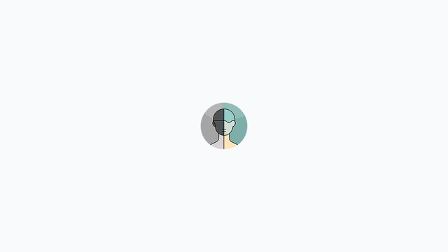
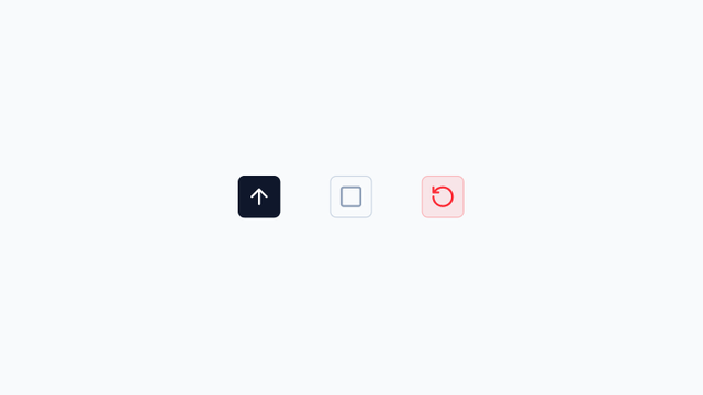


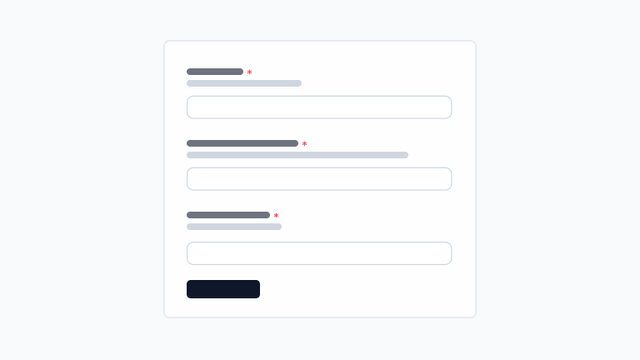
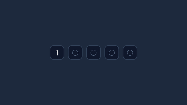
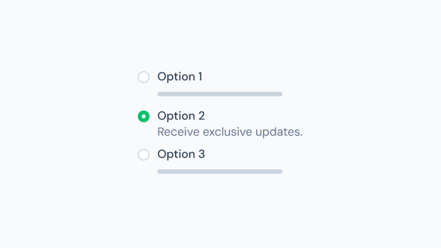
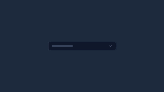
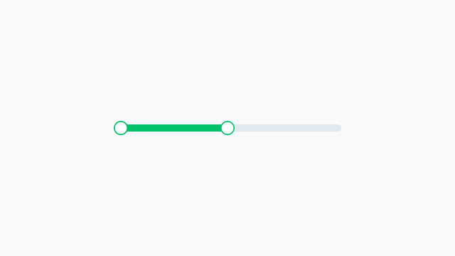
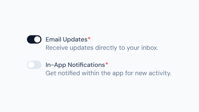
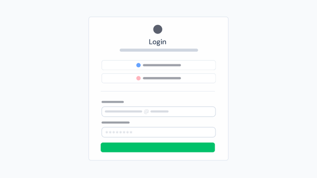
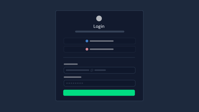
Form
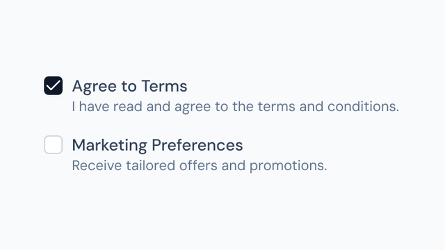
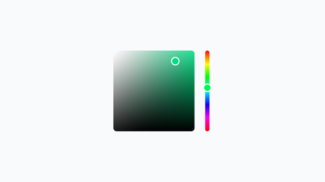
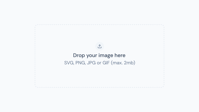
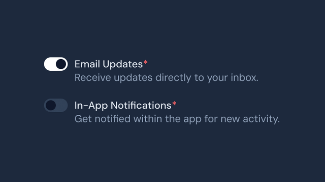
Comprehensive form components for building interactive user input flows, including text fields, selects, checkboxes, radio groups, toggles, and robust validation tools for accessible and dynamic forms.

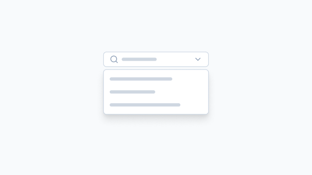


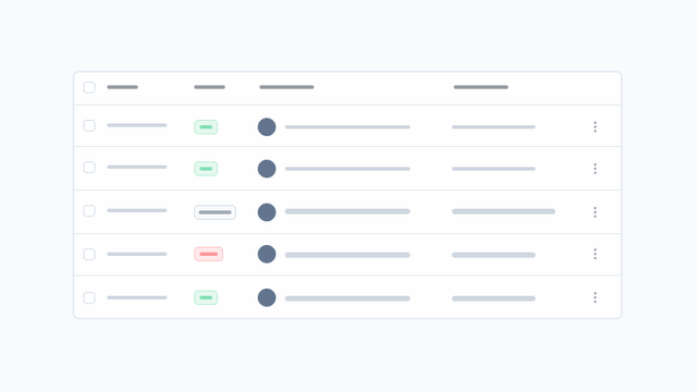
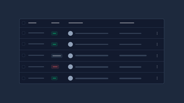
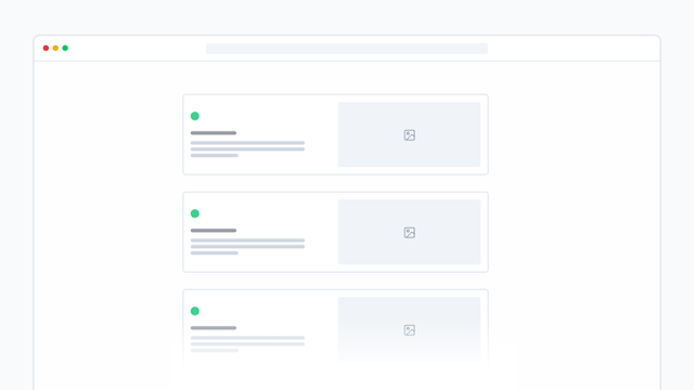
Data
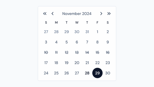
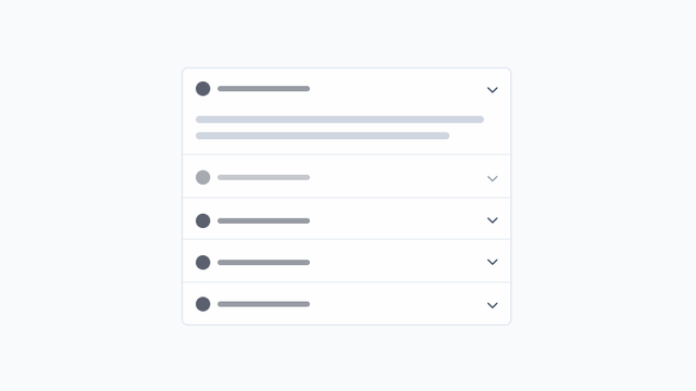
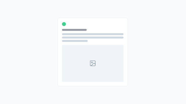
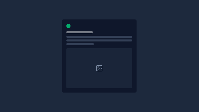
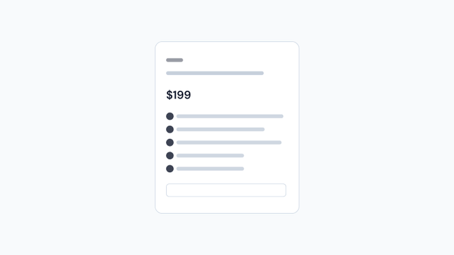
Components for displaying and managing data, including tables, lists, cards, data grids, and visualization elements.


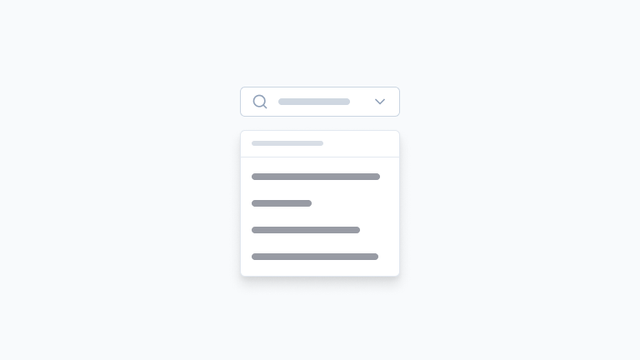
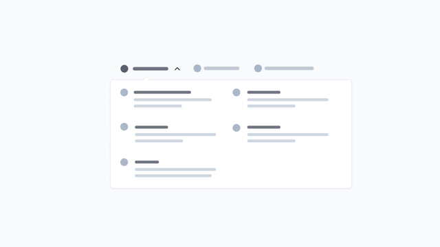
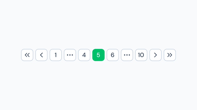
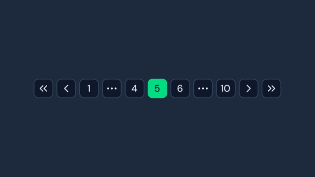
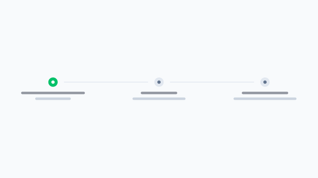
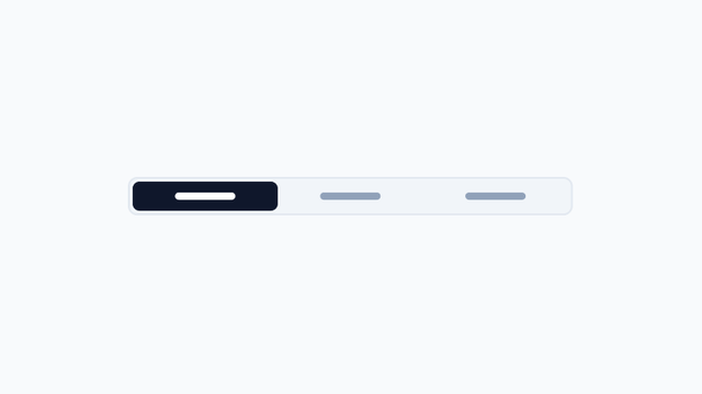
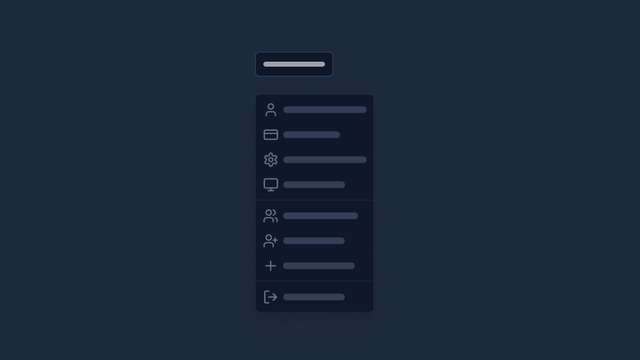
Navigation
Components for user navigation and wayfinding, including menus, breadcrumbs, pagination, and navigation bars.


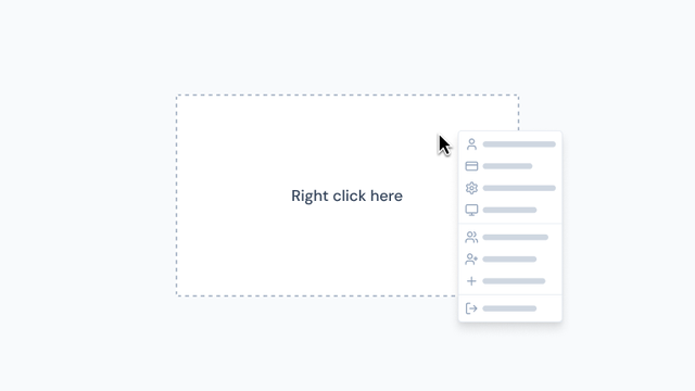
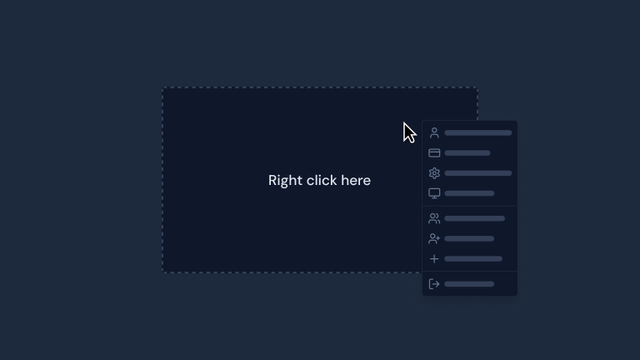
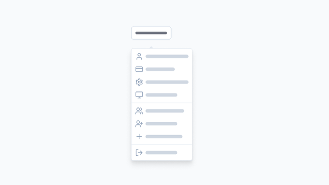
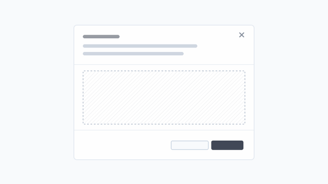
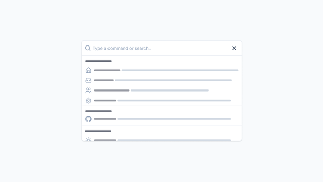
Overlay
Floating UI elements like modals, dialogs, tooltips, popovers, and other components that overlay the main content.

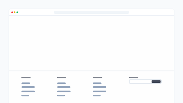
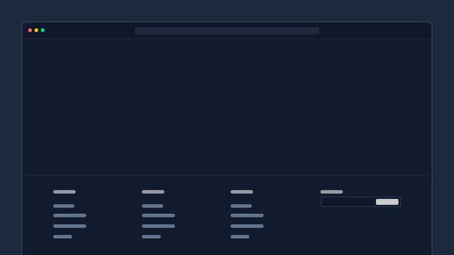
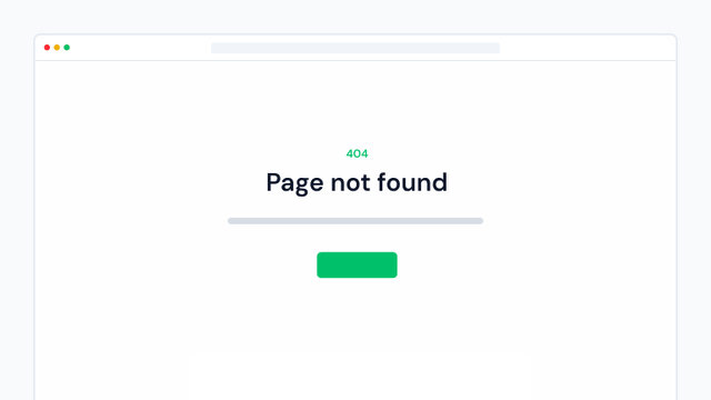
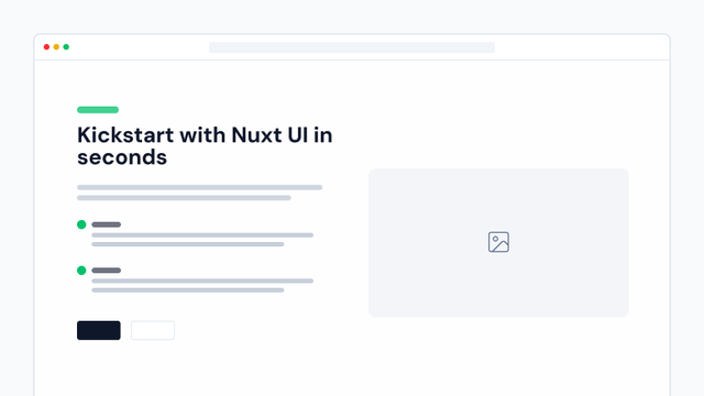
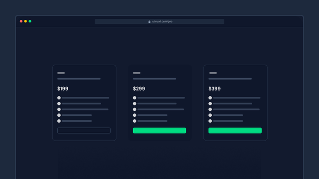
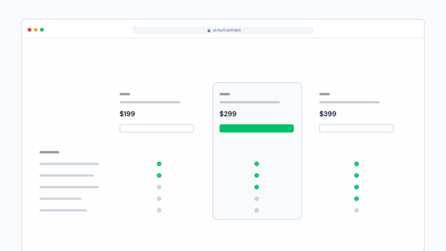
Page
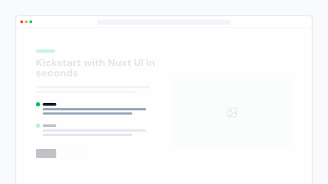
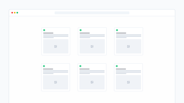
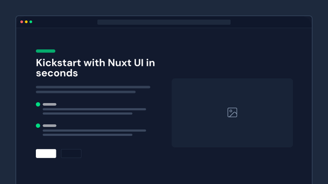
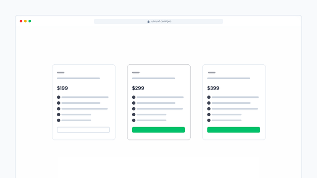
Components to build all the marketing sections of your website, enabling you to create landing pages, blogs, changelogs, pricing pages, and more.


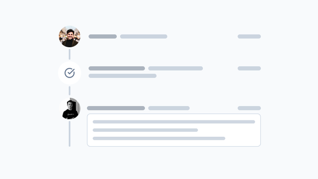
Content
Components for organizing and displaying content on individual pages, including page headers, footers, and sidebars.
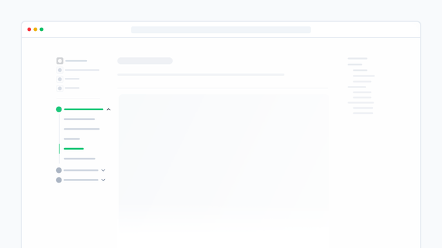

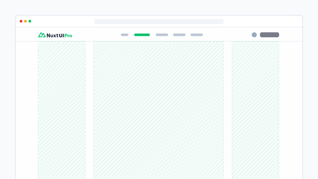
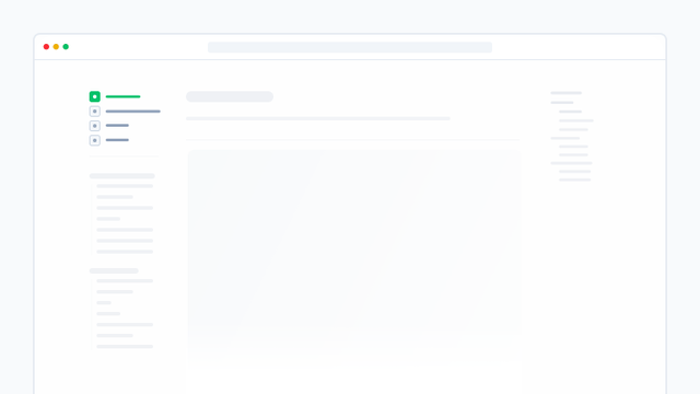
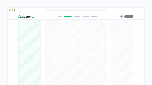
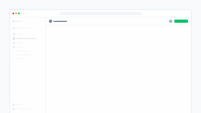
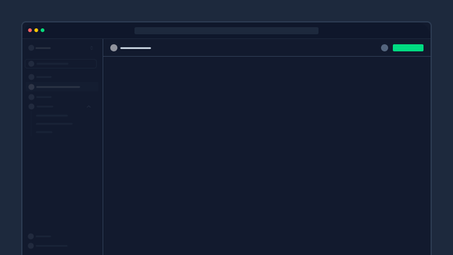
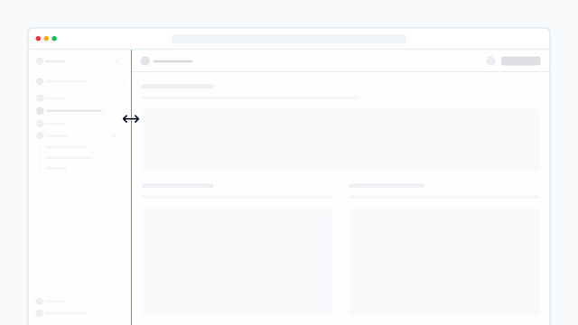
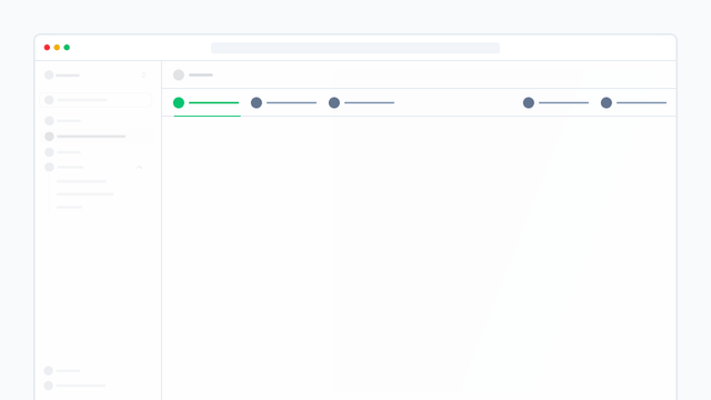
Dashboard
Components for creating dashboards with dynamic sidebars and content.


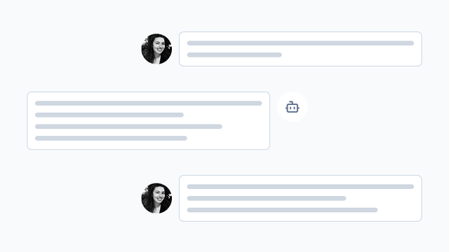
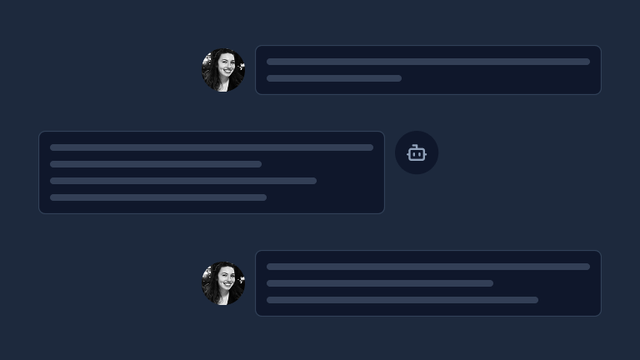
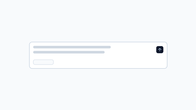
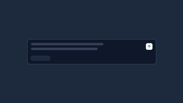
AI Chat
Components to build your own chatbot, powered by the Vercel AI SDK.

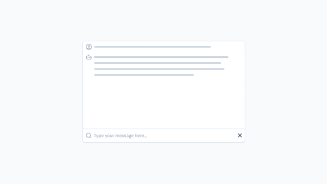
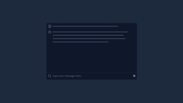
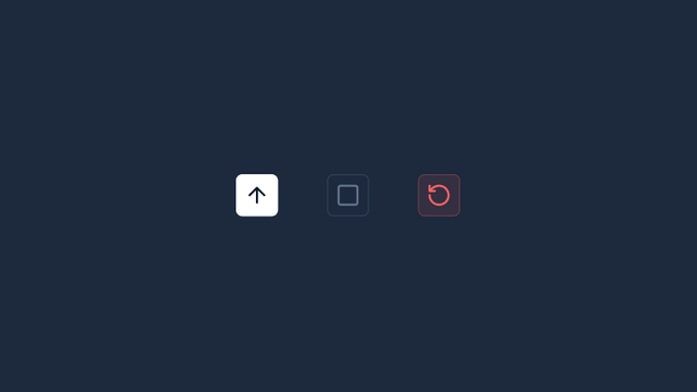
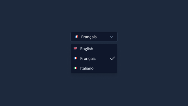
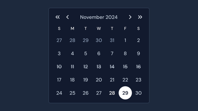
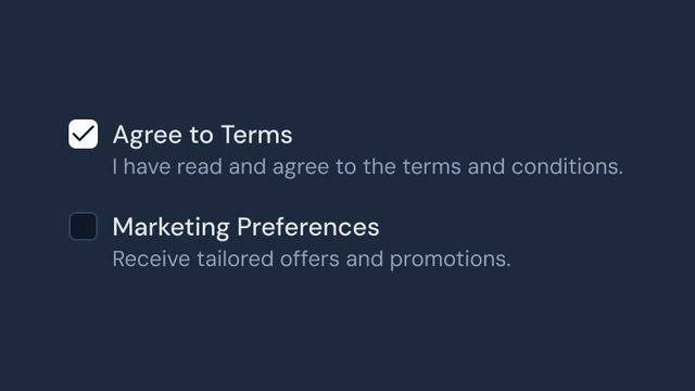
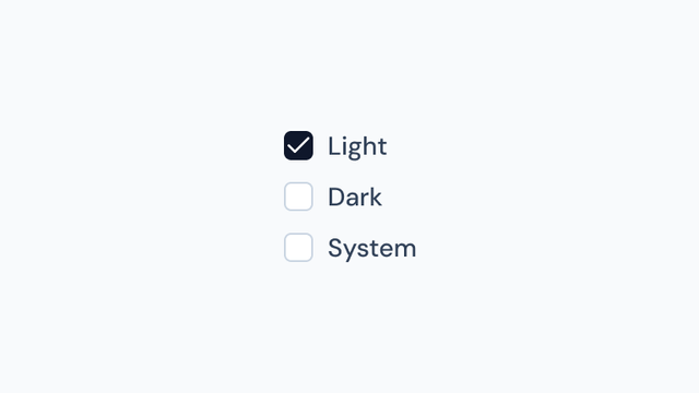
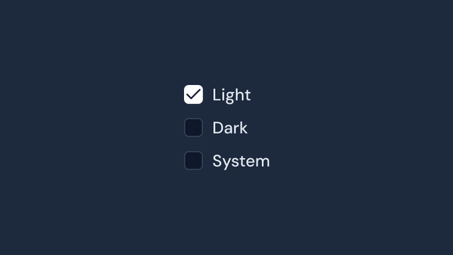
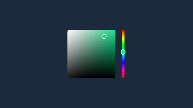
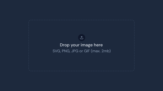
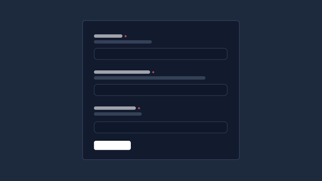
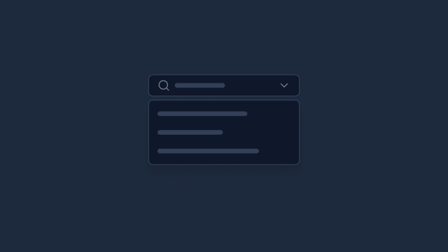
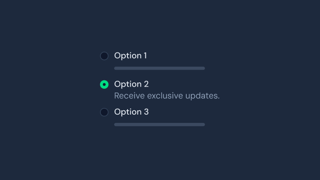
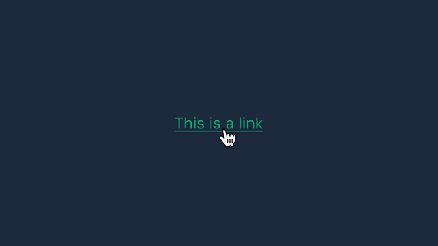
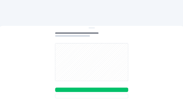
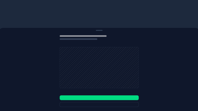
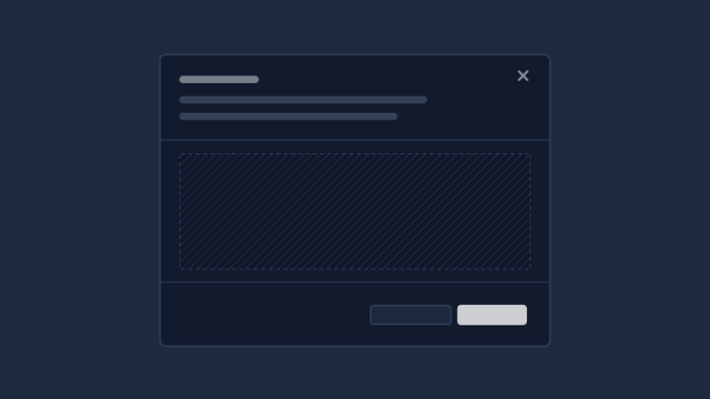
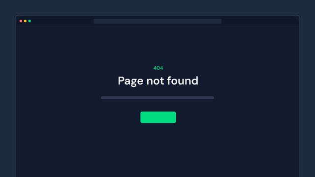
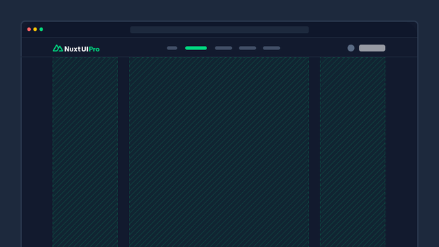
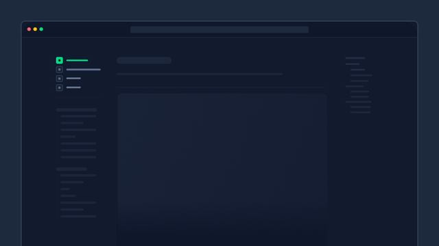
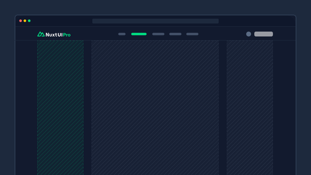
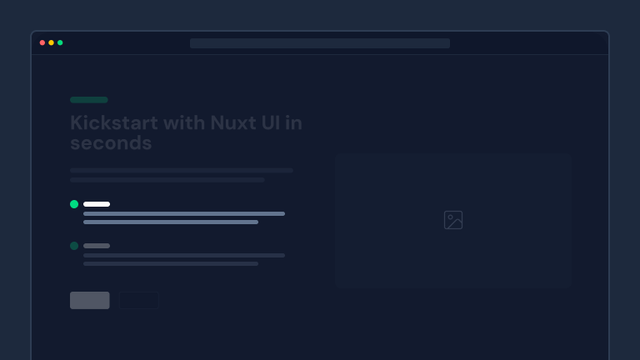
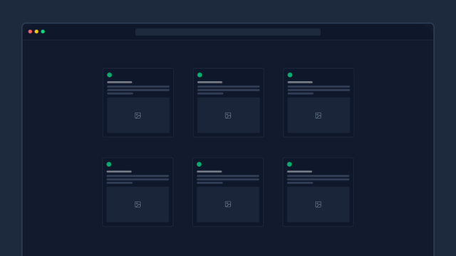
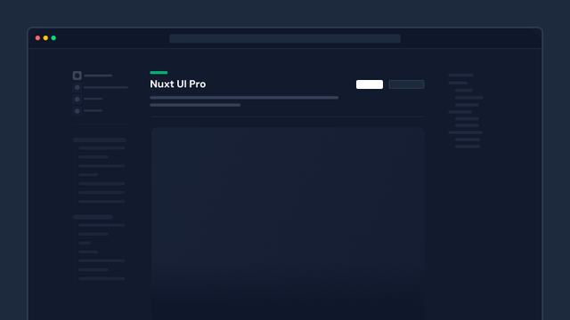
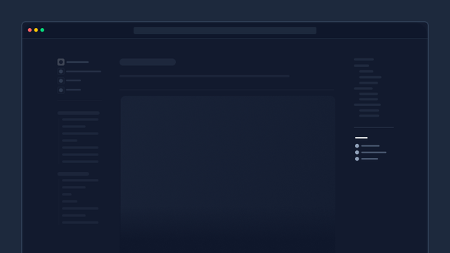
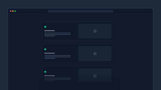
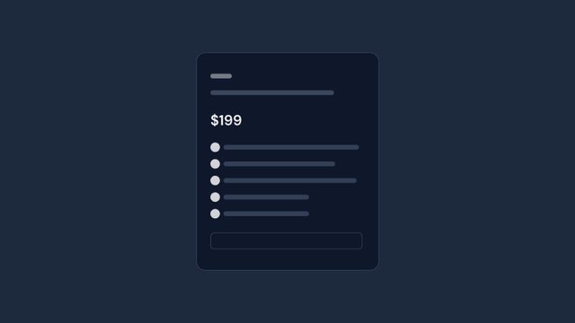
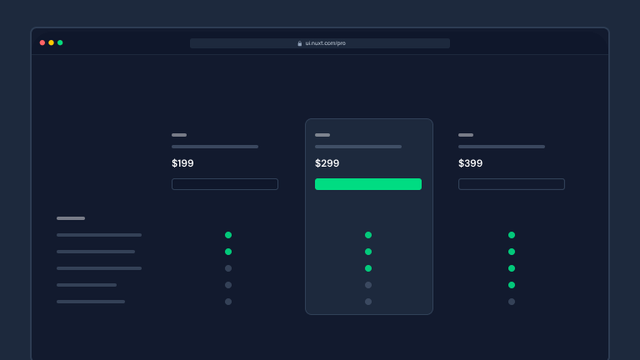
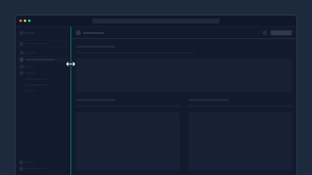
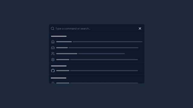
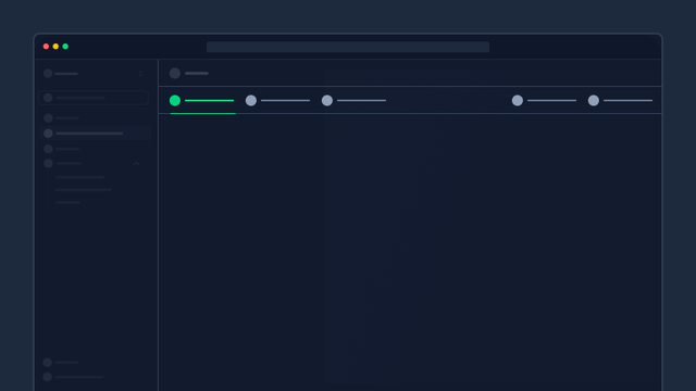
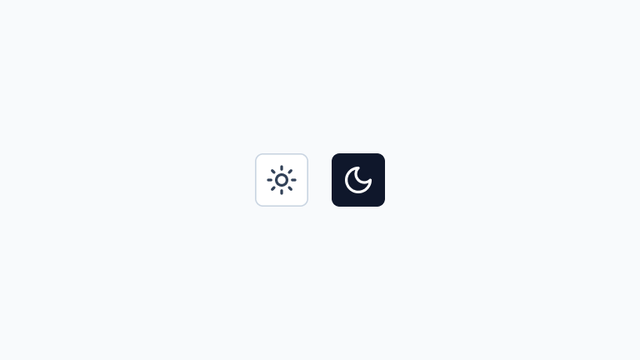
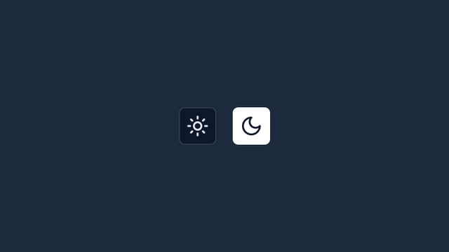
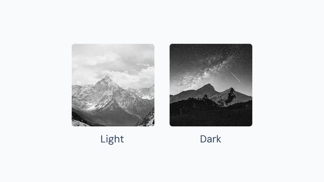
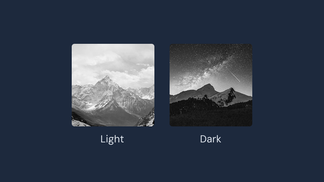
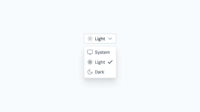
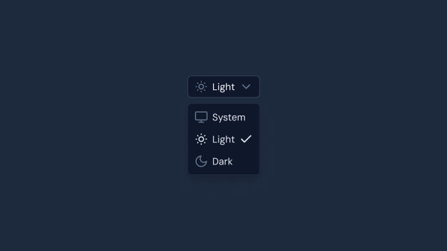
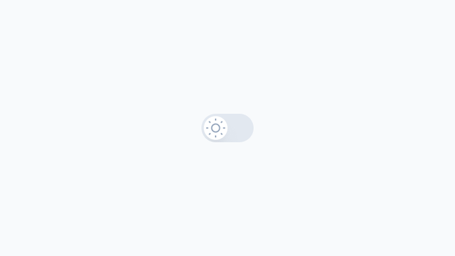
Color Mode
Components that integrate with Color Mode, enabling light and dark mode switching.

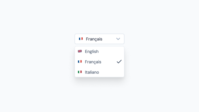
i18n
Components that integrate with i18n for internationalizing your application.